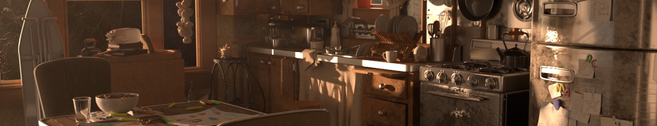
Energy Drink Commercial – 9 – Can Designs
September 25, 2018
Now, I’m no graphic artist (by any means), but here are a few W.I.P. designs. Its a bit hard to look at these because they are just straight fields of color, but they are helping nail down general composition and colors. The silver color in this case would be the metal of the can, not painted, the design is on a painted banner on the metal face.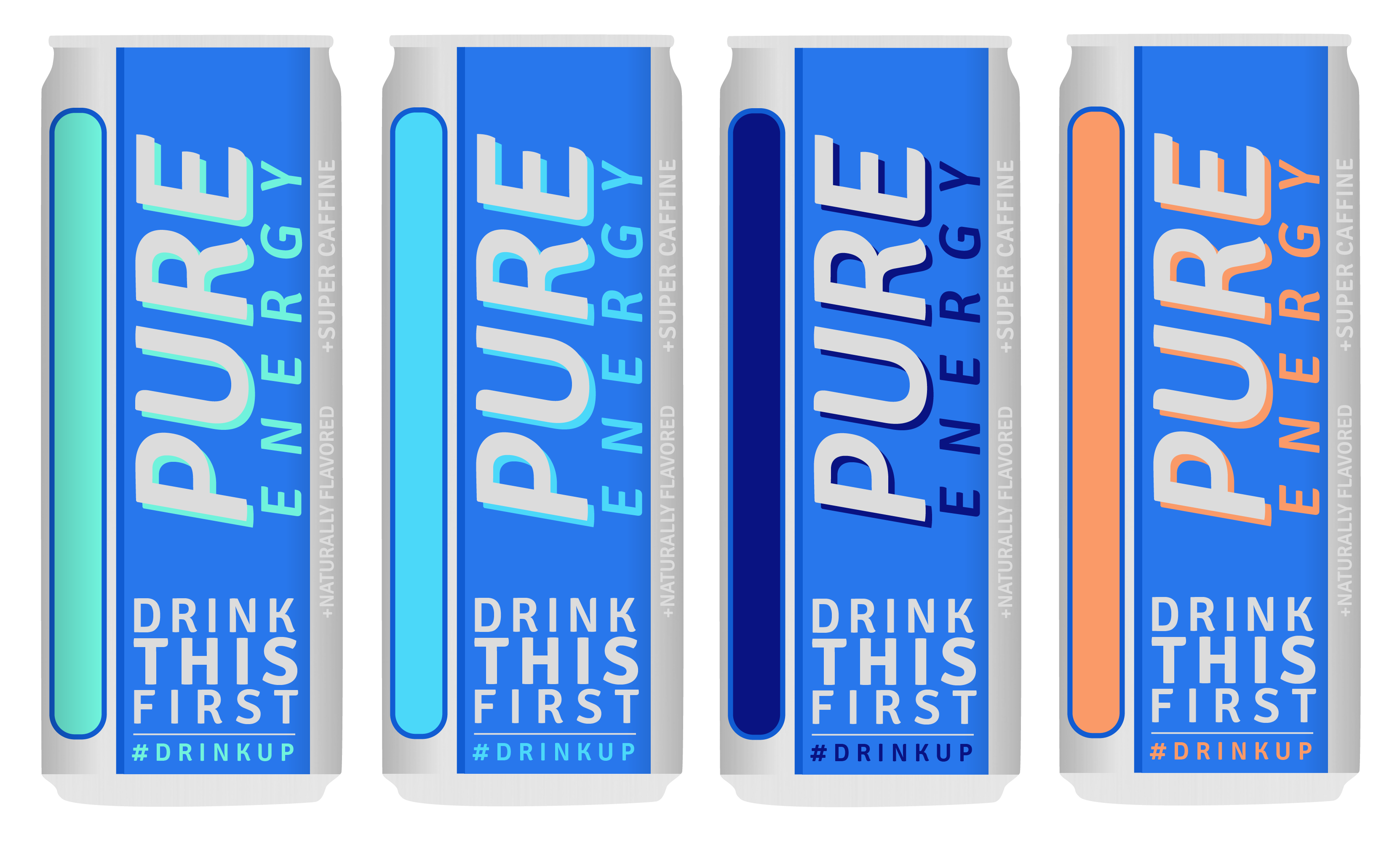
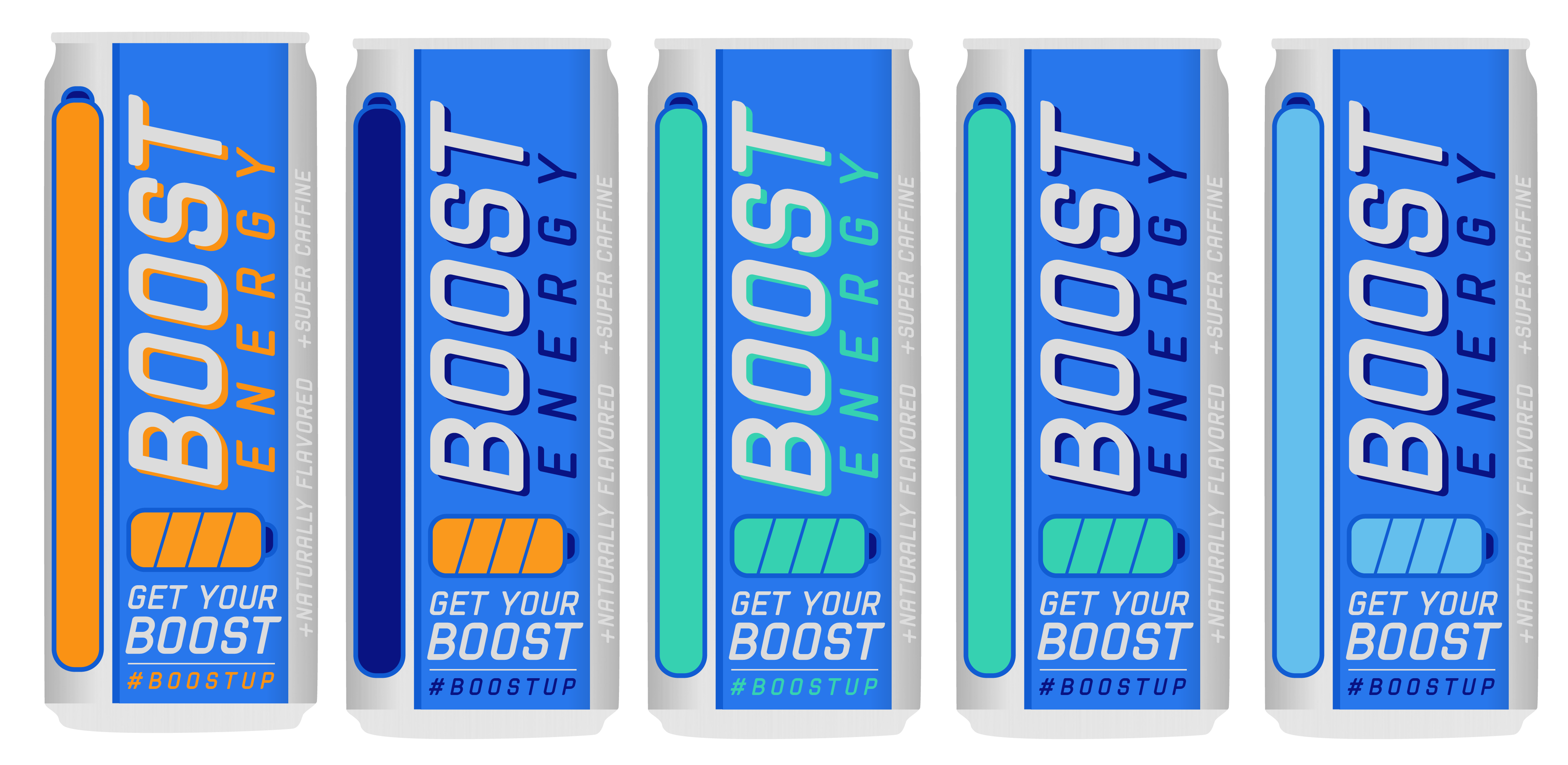
Also, in the process of creating the “BOOST” drink, I came up with a pretty crazy idea….the little bar on the left can just be a bar or be a sort of battery like on the bottom middle, but it could show into the can and show the fluid inside…. that would be really cool. It was originally inspired by NOS energy drinks, it would be used to place information about the drink and its contents, extra marketing, etc. Not only that, but it opens up a lot of really cool lighting opportunities to light from the interior, which would look amazing with the ice encapsulating the can. It would only take a fairly simple POP sim to do some bubbles inside and I think I could put together a procedural system or just basically animate any movements in the liquid.
Of course this is all more effects and MUCH tougher lighting, but it’s an awesome idea if I get extra time, it’s a cool luxury shot.