Car Commercial – 7 – Greater Bolt Width Variation
November 2, 2017
So one of the pieces of feedback that stood out in my mind was pushing the lightning bolt width variation. Before it was just mapped to a ramp so that it starts thick at the base and tapers down as the bolt travels out, similar to the profile of fur curves. This system works well, but there’s definitely room for improvement.
Its really hard to find good electrical arc reference considering its such a common effect. Not only that but most videos of actual electrical arcs are either quite poor quality or are on a much smaller scale, losing out a lot of the detail of a larger arc.
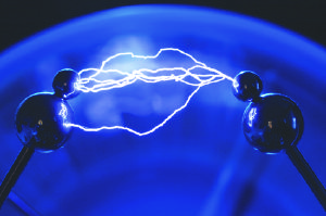
I really like this image despite it again being low quality. We see a little variation in the lightning and get an easy feel for its shape.
Lucky for me Smarter Every Day filmed some really awesome tesla coil lightning bolts. The shapes of electricity seems so ridiculously inconsistent, sometimes large winding arcs, while others are long and relatively straight squirmy lines like this video. Others look like smooth streaks of plasma fluttering through the air.
As goofy as this video is, its got a bunch of great reference for the shaping and widths of the bolts. Even though the bolts are smaller on screen, the footage is decent and consistent. I don’t want to vary the width too much, most reference doesn’t tend to differentiate much in width, but I think its definitely necessary for an interesting looking effect. Not only that but when paired over top of one another, the layering of prims will create really cool waves of noise.
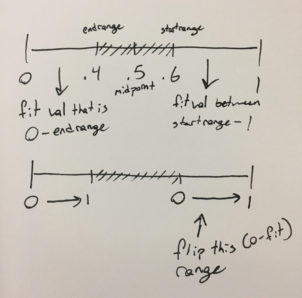
As always, some notes to help visualize. We have our range of curveu 0-1 and a section taken out of the middle. So we have values of endRange and startRange to help map our values. if we fit these values with the respective range ends then we can map either side of the lightning between 0-1. Since we are working on a linear basis and we want the bolts to taper in the middle, we have to flip one side of the curve by subtracting it from 1. This will give us a perfectly linear ramp from base to tip that is easily manipulated later.
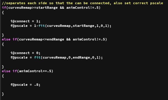
This is the main code for deleting the points along the guide lightning curves and animating this change. This section specifically selects either side of the lightning bolt in the if statement and fits its pscale correctly. If the bolt is connected (animControl == .5) then we set it to a constant value of .8. Making sure to place our ranges in the correct places in the fit function, we have out values just as predicted in our notes.
Now that we have our perfect values, lets mess with them.
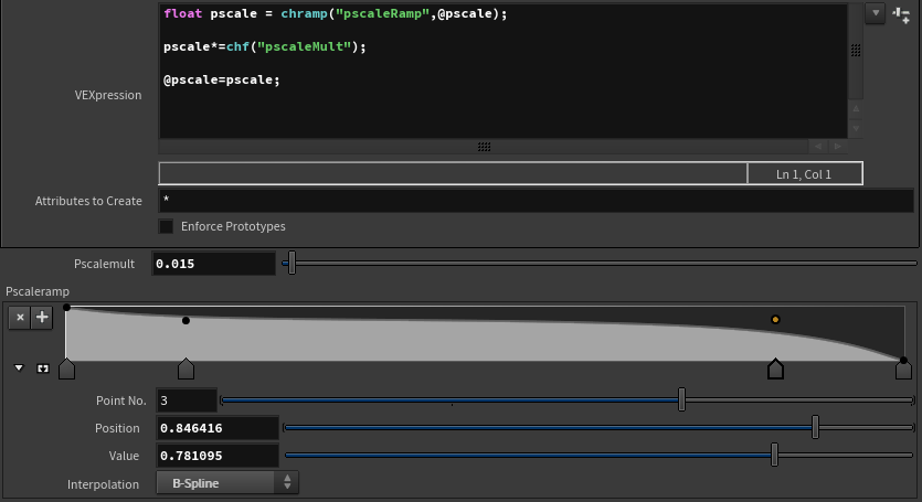
We run our pscale through a ramp to get this nice and smooth tapering effect. Note that it works on both sides correctly because we inverted the pscale on one side of the lightning. A nice little overall multiplier for some global control.
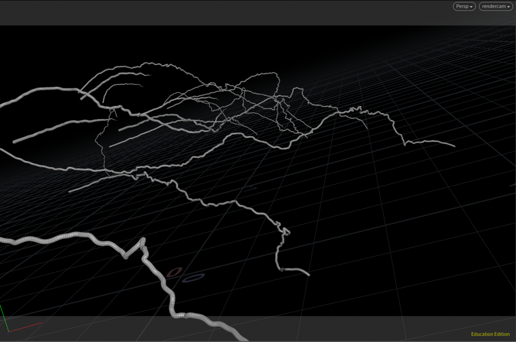
So now we have our stylized, but predictable taper, lets add some noise.

I like using point vops for noise, it’s just so much easier to look at all the parameters in a real interface for me to help visualize. We take our curveu value into the position of the noise and output a 1D noise from a 1D input. This gives us a direct noise along the lightning bolt. I take the absolute value just in case, I’m not completely sure it it actually does anything but I was getting some weird effects and it makes me feel secure being here just in case we get some kind of weird negative values we can just remove that possibility. It’s then fit into a a range around .15-.8 so that we don’t reach a complete 0 value and get breaks in the bolt, we want it completely contiguous. We take this mapping of noise and multiply it into our current pscale. I experimented with adding it but when you do that you lose the sense of the wispy tips of the lightning as it sets the value above 0 at the tips. By multiplying we get to use the general profile shape we set before basically like a mask along the curve so that we still get the thinned tips but also get plenty of variation.
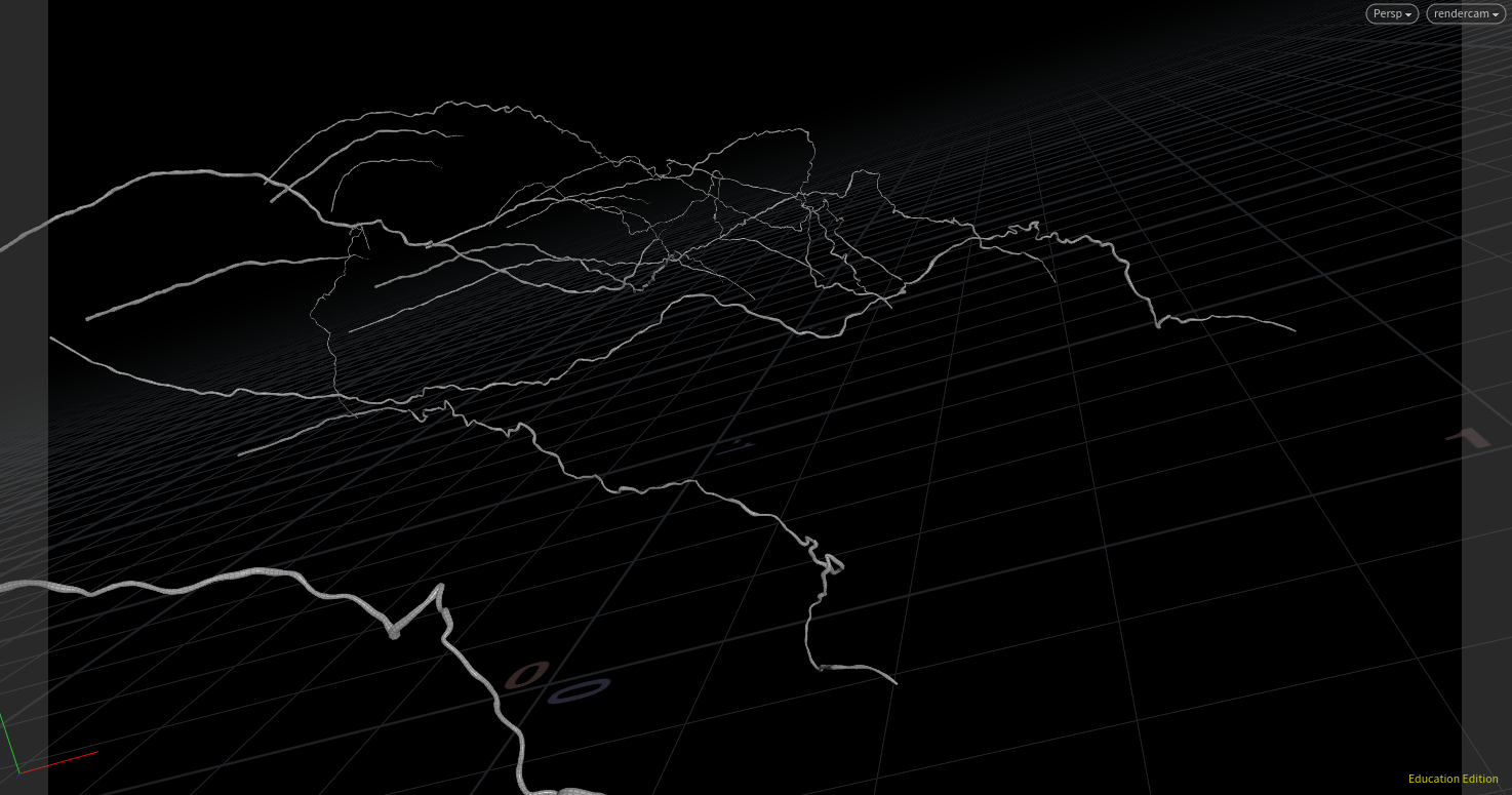
It might be hard to see in browser, WordPress is cutting down the resolution quite a bit, but an exaggerated view helps with this.
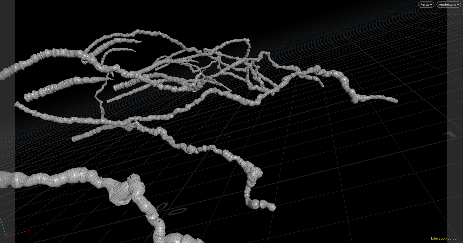
This noise is actually all over the place and looks awesome!
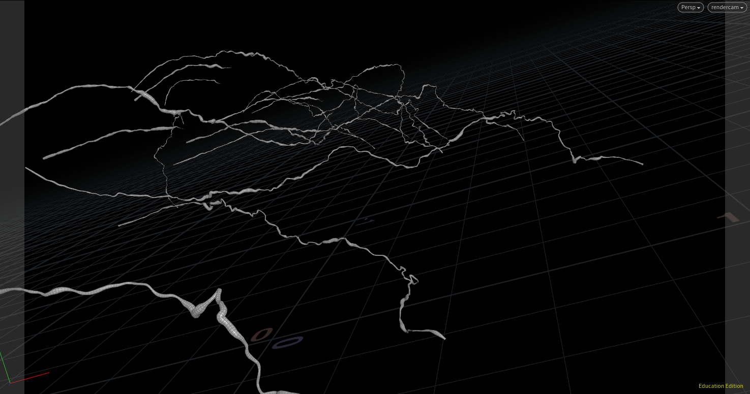
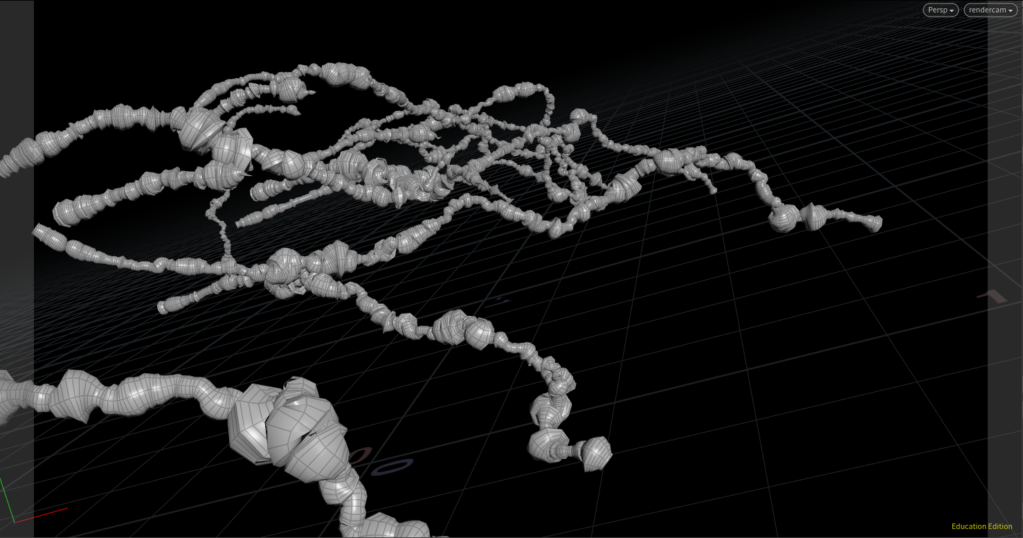
Some different settings can create some more interesting thicknesses.
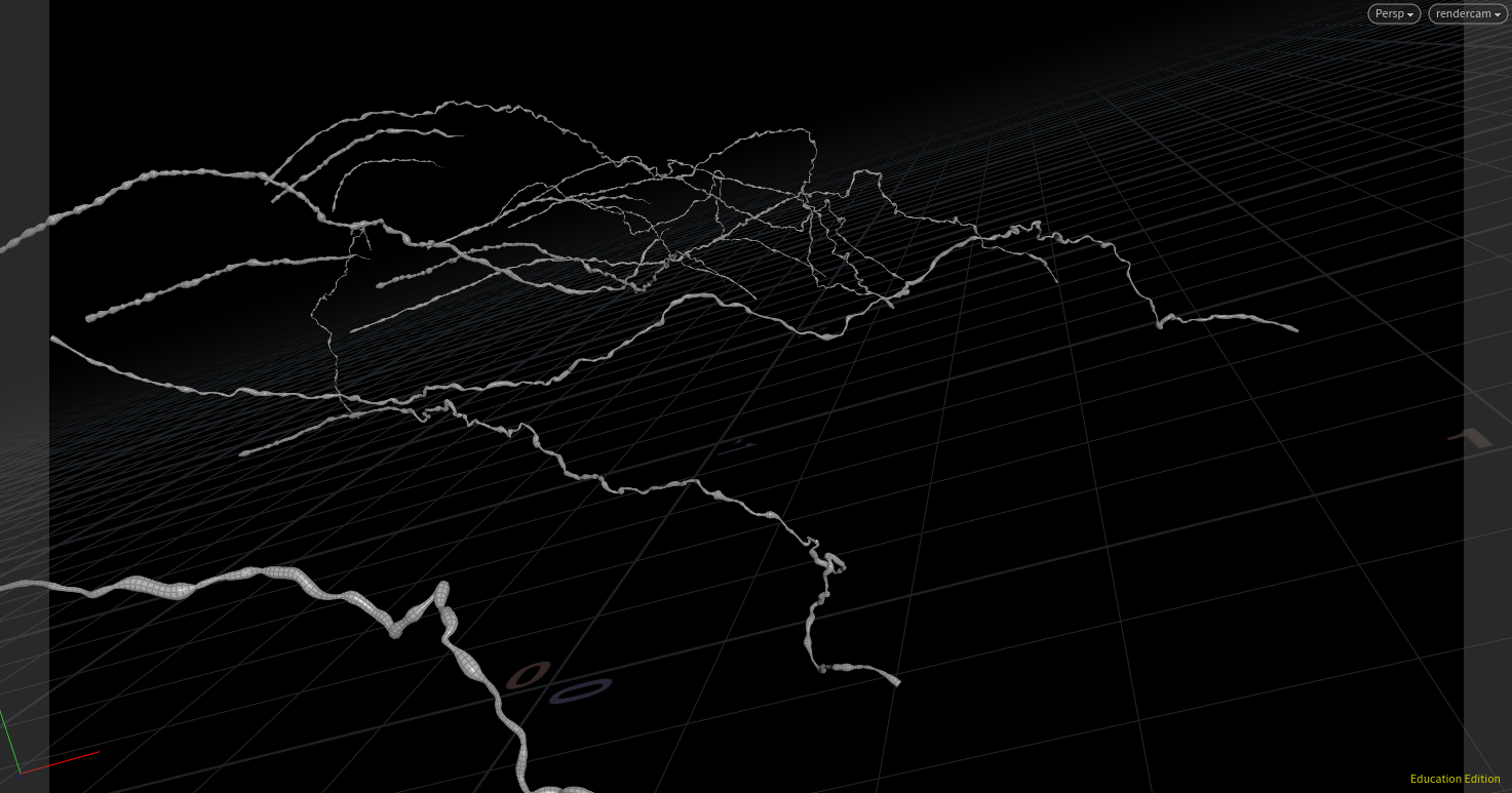
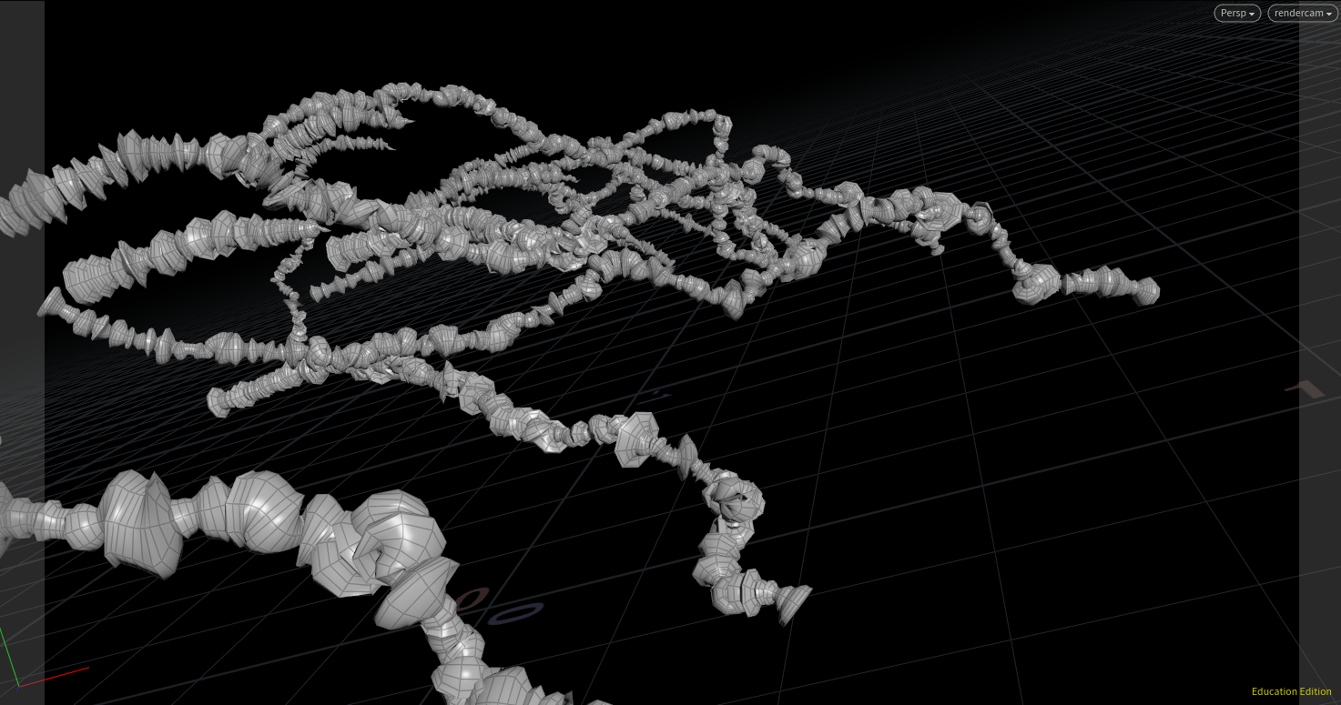
Some really frequent and rough noise makes some awesome variations too!
In my width modulation VOP I also make sure to offset the noise by the prim number, so I can’t wait to see what this looks like with grouped prim lightning bolts! Another simple but cool advancement!

